Format

Format
High Contrast Format
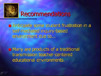
Projected multimedia such as PowerPoint is best viewed by an
audience with a light text on a dark background high contrast. See color
page for more information.
| Slide Content
Present only one concept per slide in a simple uncluttered visual design
for clarity.
|
Remember the 6 /36 rule!
Minimize information to six lines of text and no more than 36 words
per slide. Slides exist as a presentation shorthand. Slides are not a verbatim
account of the presenter's knowledge. Slides supply key information on
the subject being presented. More text than 36 words will invite the audience
to read the slide while you are speaking. Reading text is a natural human
tendency. The presenter elaborates on the information formatted on each
slide.

Title Block
Take advantage of the Title Block. It sets the stage for communicating information.

PowerPoint Slide Alignment
Flush left alignment is the first choice for readability.
|
Flush left alignment is the first choice for readability.
1. Especially for bullets & numbers |
|
|
|
|
Flush left alignment is the first choice for readability.
|
|
|
|
|
|